Penn State is now 0-5 and hasn’t really been in what’s felt like a close game since the opener at Indiana. Luckily, I found a way to (kind of) distract myself, charting each and every pass of this weekend’s game using Jared Lee’s fantastic Shiny app and code. Please check out his account and give him a follow if you don’t already. You could argue that I did the opposite of distract myself and actually paid attention more, but it was kind of calming in a way to be charting and not swearing after each play.
Either way, we now have a fun set of visualizations and data to play around with after the Iowa game. Each pass was charted to the best of my ability which gives us the opportunity to look at pass locations of complete and incomplete passes, as well as air yards.
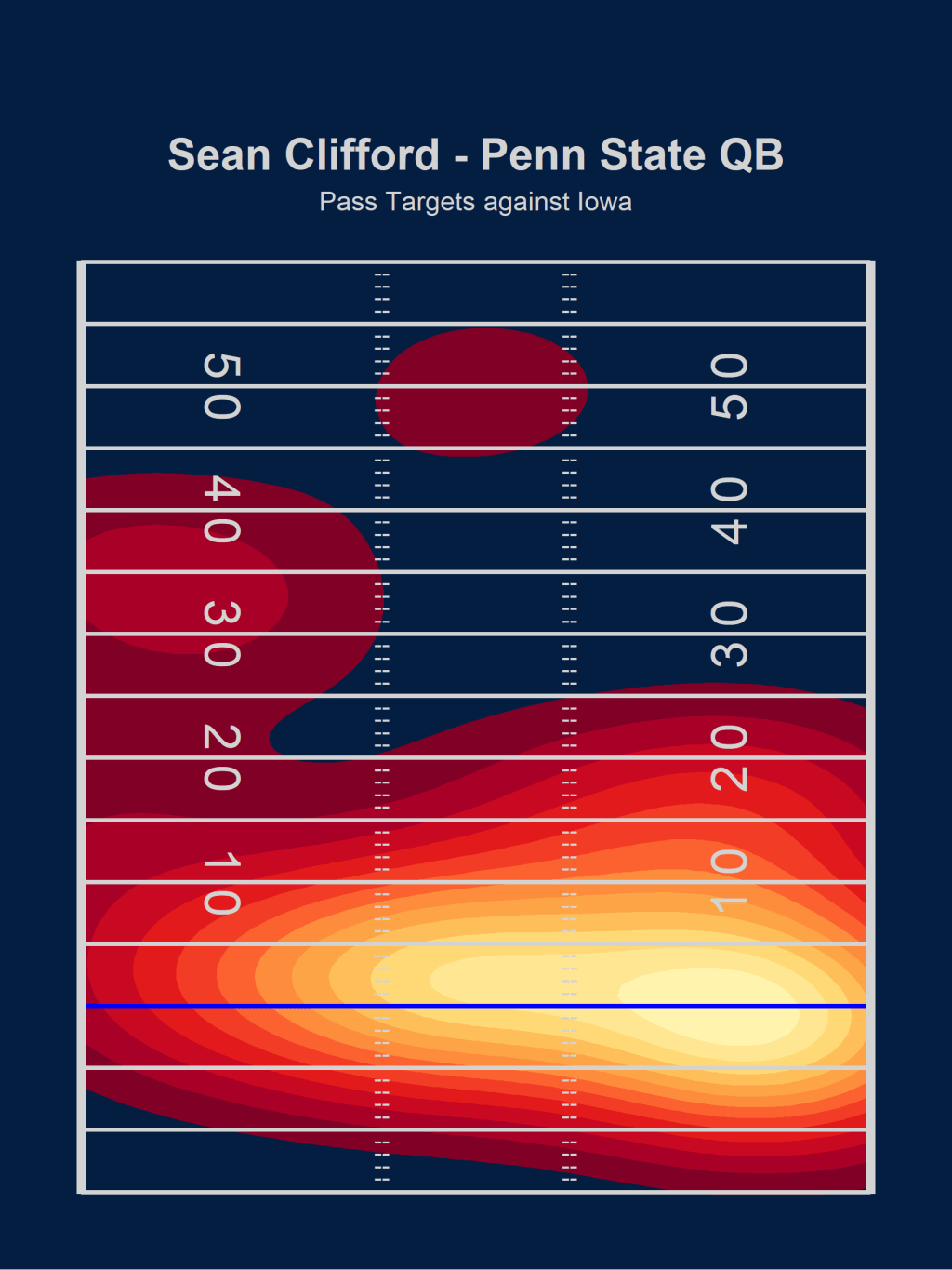
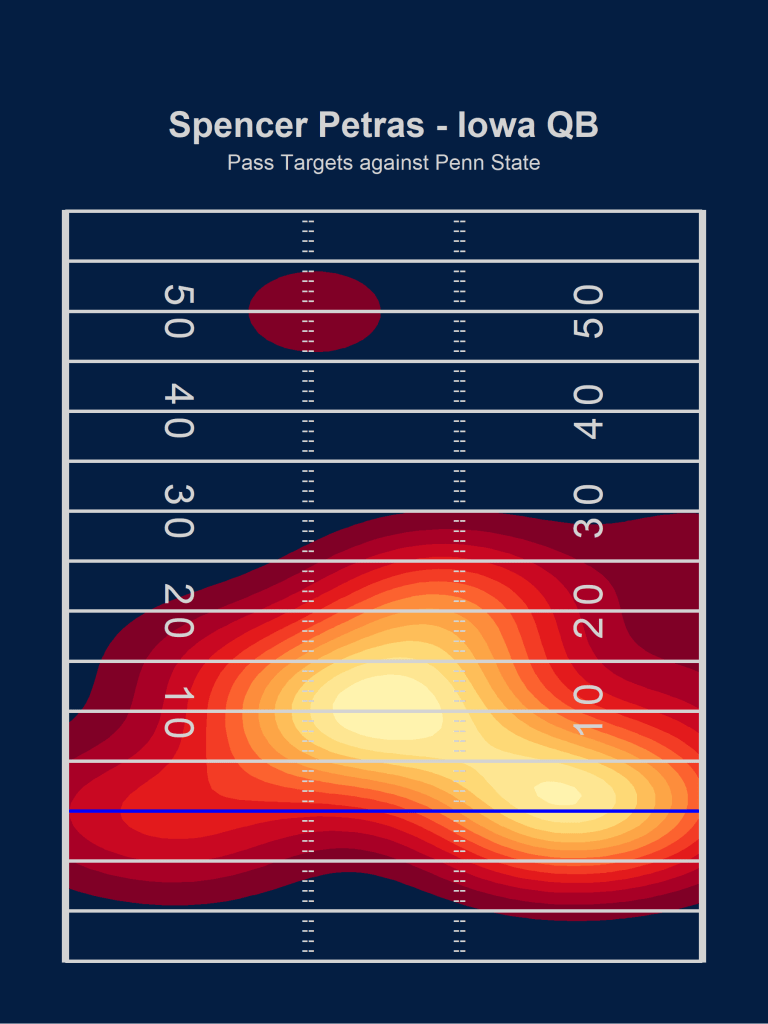
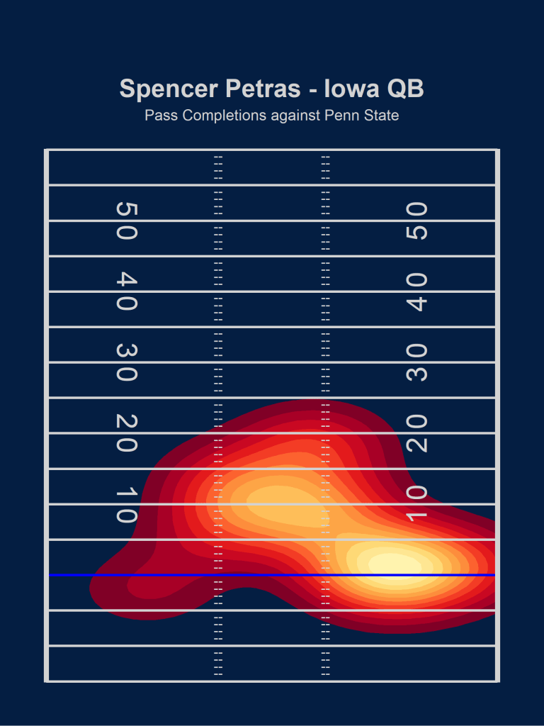
To start us off, here are the pass locations of all attempted passes by the three quarterbacks we saw on Saturday: Will Levis, Sean Clifford, and Spencer Petras. The blue line represents the line of scrimmage, and areas where more passes were completed are lighter (white and yellow) and the less thrown to areas are darker (red). Areas that weren’t targeted at all will just stay the background color blue.
Pass Attempt Locations


Charting games is a new exercise to me, so I won’t pretend to know trends at the college/team/play level, but I did find a few things in these charts interesting.
First, Will Levis clearly favored the left side of the field and a depth of throw of about five yards. He took a few deep shots, but either due to play calling or style, the majority of his throws were quick and underneath. He was the starting QB for this game after a rough start to the season from Clifford, so part of this could be due to conservative play calling from the offensive coordinator trying to get Levis into a rhythm. Levis went 13/16 and didn’t thrown an interception, so the play calling seemed to work if that was indeed the goal.
Clifford came in after Levis fumbled three times and lost two of those, and his pass chart has a little more variability than Levis’ does. He was way more willing to throw the ball deeper over the middle, but overall he still stuck close to the line of scrimmage for a ton of his attempts. You can see the high density zone that centers right around the blue line of scrimmage marker and the right side of the field. Clifford had a pair of interceptions in this one, but I honestly don’t see a ton of difference in how these two played on Saturday from strictly a pass location perspective. Yes, Clifford was more comfortable throwing the ball long and over the middle, but the modal location for both of these players was at or just beyond the line of scrimmage. They both relied a lot on yards after the catch to make up field position, and we’ll talk about that more later.
Finally we have Spencer Petras. Iowa only needed to use one quarterback in this one and in my opinion his pass chart alone looks more impressive. The modal spot looks to be about ten yards deep and dead center down the field. They were attacking Penn State’s linebackers head on and succeeding for much of the game. He only took one deep shot all game, but overall there is a good spread of where he is targeting the ball in this one. The biggest difference I see between Clifford/Levis and Petras is that center of the field attack. Neither PSU QB was able to target the center with such consistency.
Now here are the same charts, but only for completed passes.
Completed Pass Locations
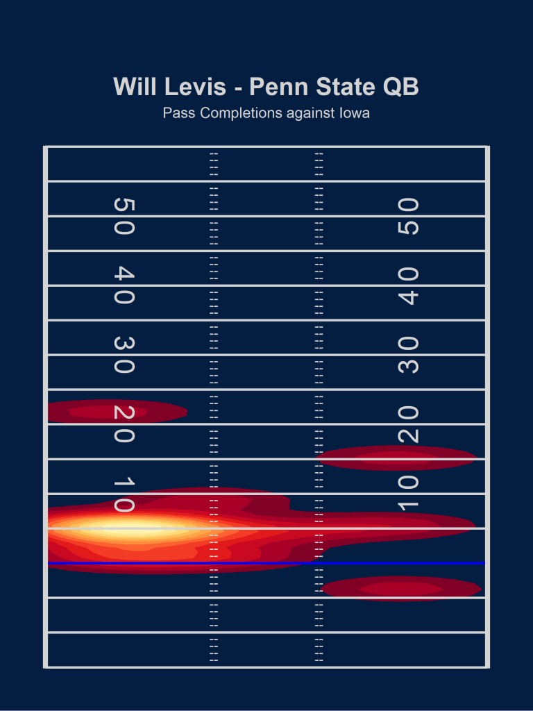
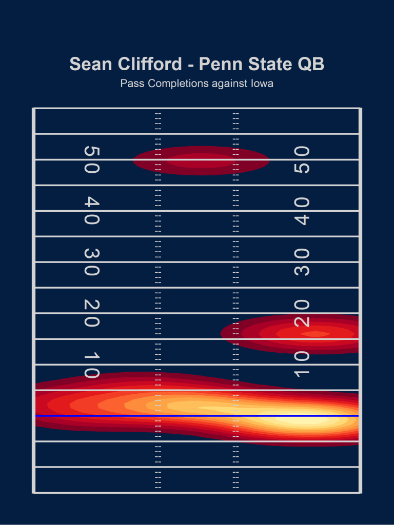
For the most part these tell a pretty similar story to the first ones, but there are some notable differences. First, it’s really highlighted how poorly Clifford completed passes in this one. He was 13/22 and the relatively wide spread of passing locations I mentioned from the first graph really starts to contract. The modal location is still at (maybe even slightly behind) the line of scrimmage on the right side, but he also gets credit for a beautiful 50-yard bomb to Jahan Dotson to get the Lions within 10. Comparing Levis and Clifford again, I don’t really see either differentiating themselves from each other – they just prefer different sides of the field, if anything.
Petras’s graph also contracts a bit as he didn’t have any completed passes over 25 air yards and wasn’t as effective on the left side of the field. That said, all of those passes we saw in the first graph targeting the gut of the Penn State defense were connecting at a relatively high rate. He also connected often on the right side about 2-3 yards beyond the line of scrimmage.
Air Yards Analysis
Looking at Air Yards/Attempt tells us the average depth of target for each quarterback, regardless of whether the pass was completed or not. This is just where they are aiming on the field. Petras had an average of 9.6 Air Yards/Attempt on Saturday, followed by Clifford at 8.5 AY/A and Levis at 6.5 AY/A. This confirms what we saw earlier in the graphs; Petras was throwing deeper on average even if he didn’t take many super long shots. When limiting the analysis to just completions, Clifford leads in Air Yards/Completion at 6.6 followed by Petras (6.3 AY/C) and Levis (5.8 AY/C). That 50-yard completion to Dotson I mentioned earlier definitely helps Clifford here.
I haven’t charted any other games yet, but I would love to compare these to a Clemson/Alabama/Florida passing attack, because I would have to guess that their average depth of target is deeper than any of these quarterbacks.
Finally, we can track the percentage of a player’s passing yards that came in the air. If you throw the ball one yard and your receiver runs 80 more for a TD, a QB’s passing yards obviously include that 80 yard run after the catch as part of the passing yards. That’s not necessarily wrong, or an “incorrect” way of doing it, but it’s definitely incomplete. It doesn’t tell the whole story. To that end, we can calculate the percentage of passing yards that came in the air and see how it compares. In this game, Levis had 76.7% of his passing yards occur in the air compared to 57.5% for Petras and 53% for Clifford. Like I said, there can be many reasons for differing percentages. For example, here’s
- Scenario 1: a QB can dump the ball off for one air yard and have their receiver run 80, and maybe the receiver makes a bunch of defenders miss and is really the star of the play. Low percentage air yards for that QB.
- Scenario 2: a QB throws the ball for one air yard and puts it in a great location such that the WR can run cleanly onto the ball and has open grass in front of him (throwing your receiver open). Low percentage of air yards for that QB.
- Scenario 3: a QB throws the ball for 50 air yards and hits his WR in stride who finishes the play out for a TD. High percentage of air yards for that QB.
- Scenario 4: a QB throws the ball for 50 air yards and the WR has to stop cause it’s slightly underthrown and gets tackled as soon as he catches it. High percentage of air yards for that QB.
These examples serve to illustrate that the percentage of passing yards that occur in the air alone can’t rank or compare quarterbacks. Scenarios 2 and 3 are great QB play but have vastly different percentages, and Scenarios 1 and 4 are less impressive QB play and also have vastly different percentages. With that said, I think it’s a really fun and interesting stat, but it’s always important to keep the context in mind!
I plan on charting a few more games in the future to hopefully spot some more trends and compare quarterbacks, and I think it’s a great tool that I’m excited to bring more of to Staturdays.

Leave a comment