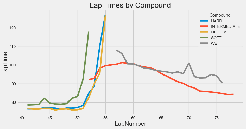
Fernando Alonso and Aston Martin ended up making a crucial mistake as the rain started to fall, opting for a set of Medium compound tires as everyone else jumped on the Intermediates. It ended up costing him an extra pit stop just a lap later and the approximately 25-second delta along with it.
Had he and the team made the correct decision the first time, is it possible that we could’ve had a race for P1 in the final 20 laps?
Let’s use the best intermediate times as a reference to see what could’ve been possible in the crucial lap between Alonso and Max Verstappen’s pitstops.
The Lap Before
On lap 53, the hard was still the fastest tire, with George Russell clocking the fastest lap. So Alonso would have no data to go on to know that the inter would soon be the fastest. Valtteri Bottas and Lance Stroll would be the first to try them on, with their first full lap of data coming on Lap 53. Of course, Alonso was ahead of them so would have had less time to know the results of those laps as he’d already be well into Lap 54.
Alonso Boxes
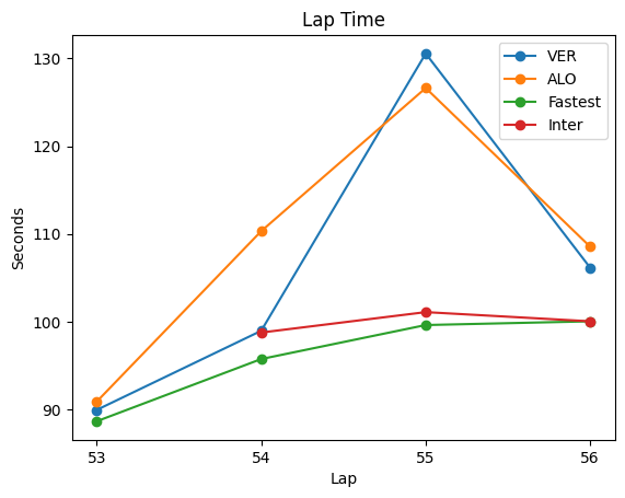
Before Alonso’s first pitstop on lap 54, he was 9.8s behind Verstappen. At the end of his first stop, he was up to 26.1s behind, with Verstappen yet to pit, with his stop taking 24.4 seconds in total. If you’re wondering why he wasn’t 34.2s behind, it’s because Verstappen had some major moments on Alonso’s pit-in and pit-out laps that helped ease the damage of his stop tremendously. All the more reason the tire choice was crucial.
On 54, the Medium was the fast tire with Charles Leclerc clocking a 1:35.7 and the fastest Inter a 1:38.7.
Verstappen Boxes
This is where it gets interesting. While the Hard, this time of Lewis Hamilton, was yet again still the faster tire on Lap 55, the Inter was only 1.5s slower and closing the gap as people still on slicks started to slide.
Verstappen would make his one and only pit stop on lap 55 in 24.8 seconds, coming back out on the Inters. However, a major point is his in-lap, which was an astonishing 130.6 seconds, 31.5s slower than Alonso’s in-lap a lap before! This theoretically does Alonso massive favors, essentially erasing any time he lost in the pits.
Alonso Boxes Again
On the same lap, Alonso would pit a second time for Inters as well, this time in 25.9 seconds, and unerasing the advantage that Verstappen handed him that very same lap.
What Could Have Been For Aston Martin
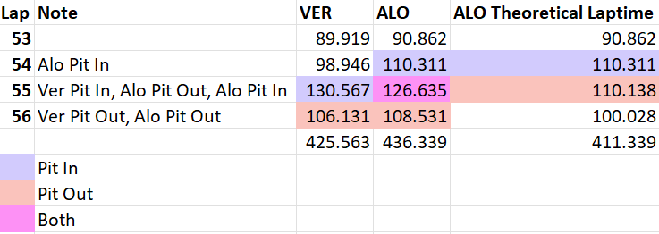
So, if we keep his pit-out from lap 55, subtract Alonso’s second pit-in from Lap 55 and his pit-out from 56, then he makes up 20.4s on Verstappen in Lap 55 alone (mostly due to VER’s stop and slow in-lap), but crucially another 6 seconds on Lap 56 (instead of the 2.4 seconds he lost to VER in actuality on 56).
In all, Alonso left 25s on the table by pitting a second time (right around the pit delta), and could’ve ended up 2.2s ahead of Verstappen at the end of Lap 56 had he gotten Inters the first time and ran them at their best pace for two laps.
In reality, he ended up losing 10.8s to Verstappen with his double-pit. The only reason he didn’t lose more was because Max struggled mightily on his pit-in lap as well as the previous lap.
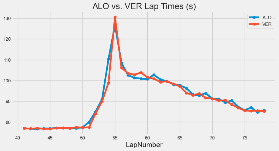
In the last 22 laps, Verstappen pulled out another 4.8s on Alonso, so Max definitely had better pace once both were on the Inters. However, at Monaco, you could easily imagine Alonso being able to hold off the Red Bull, even with its quicker pace.
It’s impossible to know for sure if Aston Martin would’ve pulled out the win, but it certainly looked promising up until that pit stop blunder.
The tire that flew off Kirkwood’s car weighs about 22 lbs. and was traveling upwards of 200+ mph when it detached and careened (thankfully) over the grandstand and into the concourse. That impact could have been deadly for spectators. Just look what it did to a car it hit.
From Kyle Kirkwood’s in-car cam sliding with sparks and a wheel lunching over the fence, this is no doubt an accident will never forget.
Indycar got away with one there. While it is unusual for a tire to detach from the car due to the wheel tethers in place to prevent it, I wonder if Indycar and Indianapolis Motor Speedway make any changes as a result of this incident, either with stronger tethers or maybe taller fences in the corners. I wouldn’t want to sit back and hope that it doesn’t happen again.
McLaren was their own worst enemy
McLaren had some of the fastest cars all month long and kept 3 of the 4 in the running for the win until the last stint. That’s when things fell apart.
To start, Rossi took the air off Rosenqvist’s wing and sent him up into the wall. Of course, it wasn’t intentional, but when you’re racing a teammate, you could have the courtesy to postpone that move until the next straight.
O’Ward was poised for a victory being on 10-lap newer tires than the leaders and full-rich on fuel going into his last stint. Then he dove down onto the apron into T3 on Ericsson. He put a tire on the grass and that was it. It’s too bad they didn’t see the race through to the end because both cars really had a shot with their speed.
Pato still lacks patience and maturity
Not to harp on this fact, but Pato O’Ward ruined his own race when he took an unnecessary risk and wrecked out with seven to go. To make matters worse, he still can’t admit his own fault, instead claiming he was “too nice” and “got squeezed” into T3, and then ominously saying he “won’t forget that one”. Call it like it is, Pato: you made a risky move into 3, refused to back out, put it in the dirt, and lost it.
He is making enemies in the series where most drivers are friendly. He threw away another race in Long Beach with a similar “send” which the first time he got away with—ruining Dixon’s race in the process—but the second time didn’t work out and ruined his own race.
If he wants to win a championship (or a 500), he needs to keep a cool head for the entire weekend. The question is: how many chances does he get before McLaren doesn’t want to wait for him to mature. With his talent and raw speed, my guess is he’s got plenty more strikes, but he’s wasting opportunities for good points every time he puts himself in these precarious positions in races.
At a certain point, swerving to maintain the draft isn’t worth it
I was losing my mind when I saw Ericsson follow Newgarden practically into pit lane on the final straight (in fact I thought they were pitting for some reason!) I thought for sure that a deviation off the racing line that dramatic could not possibly be quicker… draft be damned.
A screenshot of Newgarden and Ericsson swerving left toward pit lane on the final turn of the last lap while the rest of the field stay on the racing line.
So I took a look, and my first thought was to compare them to the guy behind, Santino Ferrucci, who clearly does not swerve on the final stretch and also loses the draft because Newgarden and Ericsson are so far off-line.
Sure enough, he gains on both Newgarden and Ericsson off the exit of 4 to the start-finish line. He gains on Newgarden to the tune of almost a tenth, and Ericsson half-a-tenth. Extrapolating that to Ericsson, he could’ve gained half-a-tenth on Newgarden just by staying straight! He lost by a tenth, so it may not have mattered, but it could’ve been closer!
Maybe next year the driver in 2nd off the final turn will stay straight on the last lap instead of falling into this trap.
The teams need to agree on a red flag restart procedure before the race
It’s fine if Indycar wants to finish under green whenever possible and uses red flags to make sure that happens. But it shouldn’t be a surprise to the drivers and teams!
This is a sport of timing to the ten-thousandth of a second and races decided by centimeters. Yet when the end of the race comes around and they need to decide whether to red-flag or finish under yellow, it feels like they’re making it up on the fly!
I think this is an easy fix and one of the clear takeaways after the thrilling, but unorthodox, one-lap shootout. A couple ex-drivers on the broadcast in James Hinchcliffe and Danica Patrick, as well as both Marcus Ericsson (the chief anti-beneficiary) and Alexander Rossi mentioned how a pit-out to green with no full warmup lap was unheard of. We shouldn’t be dropping that on the field on a whim.
I get that this is entertainment and it’s better for the fans if the race finishes under green. I’m fine with that. But make it a written rule so everyone is always on the same page. The finish at the Indy 500 should be regulated the same way it is the rest of the season, where they traditionally would’ve finished under yellow.
Recently I listened to an episode of Freakonomics Radio where they talked about specialization in the NFL. Specifically, they were talking about how the long snapper position has become something that NFL teams specifically draft for and pay upwards of $1 million a year to have on their 53-man roster. This got me wondering: what other positions are ripe for specialization in the NFL?
This train of thought brought me to the field-goal unit. Not the kicker, holder, or snapper, but the defense. What if teams hired the tallest guy money could buy to do one thing: block kicks? It’s so obvious that I assumed there must be a reason teams aren’t doing it, or at least trying it. This sent me down a rabbit-hole of heights and wingspans, standing reaches, verticals, salary caps, and something I’m not very good at: geometry.
So why don’t NFL teams pay a really tall guy to block field goals for them?
Is Blocking A Kick Just By Being Tall Even Possible?
My assumption for hiring a tall guy to block kicks is that he wouldn’t need to work hard to do it. In my experiment, he doesn’t even cross the line of scrimmage. He just stands there, arms raised, and jumps to try to swat the ball down. So is this even a feasible strategy? How high does the ball travel over the line of scrimmage? Obviously kicks get blocked, but usually the defender has some penetration. What if he was at the line of scrimmage?
Thankfully I didn’t have to break out the geometry textbooks to figure this one out. I used this nifty website to calculate exactly how high the ball would be above the line of scrimmage at different kick angles. The assumption here is that the ball is on a straight upward trajectory as it crosses the line of scrimmage, and that the kick is taken from 7 yards out. Here are some heights at various kick angles.
Angle(Degrees)
Height at Line of Scrimmage (Feet)
30
12.1
35
14.7
40
17.6
45
21
According to one study, the optimal launch angle for a kick is between 38 and 45 degrees, as this will maximize distance. Thus, we can assume that kickers are going to be aiming for that angle. Of course, human error and misjudgment will mean that some kicks go below or above that ideal range.
Graph from the University of Nebraska study which found that even at different kick speeds, 45 degrees was still the optimal angle.
So according to our geometry and assumptions about the ideal angle, most balls will be flying over the line of scrimmage 21 feet in the air, far out of the reach of even the tallest NBA players. But, at launch angles of 35 degrees or lower, we have a glimmer of hope, maybe.
Let’s take a famous big guy in the NBA: Boban Marjanovic. The 7’4″ center has a 7’10” wing span, and a 10’2.5″ standing reach. He’s one of the few NBA players able to dunk the ball without even jumping. He has just a 23″ vertical leap, putting his overall potential range at 12’1.5″. A truly enormous human being. It’s hard to comprehend. However, he’s barely tall enough to block a 30° kick, and that’s with a perfectly-timed jump.
With that being said, it’s highly probable that Marjanovic gets his hand on at least one kick during the season, and if he can make it even half a yard toward the kicker, he takes the vertical height down a cool foot, making it that much easier.
There were just 14 field-goals blocked in 2021, out of 1066 field-goal attempts, meaning just 1.3% of all field goal attempts at any distance were blocked. Honestly, that’s higher than I was expecting. I think it’s reasonable to assume that our tall guy could attain at least that and maybe a half-point to a point higher over the course of a season.
There would also likely be psychological effects on the kicker of having such a large human towering over the line of scrimmage, and the kicker may subconsciously put unnecessary height on the ball, decreasing its horizontal travel. This would especially be apparent early on, when it’s a new phenomenon for the kicker and they have not seen this type of player in front of them before.
One other logistical challenge in blocking a kick is that it’s not a given, even if the ball is low enough, that your center gets a hand on the ball. What kind of reaction time would be necessary to accurately block a kick from the line of scrimmage?
According to a highly cited paper, a field goal travels around 19-22 m/s, or 21-24 yards/s. Meaning the ball will reach the line of scrimmage in approximately .33 seconds. That’s about 80ms longer than the average human reaction time, meaning our NBA center could reasonably have some reaction to the ball in that time. How much is another story, but with good positioning I don’t hate our chances.
So all-in-all, I think we can safely say it’d be difficult, but not impossible for a big guy to block kicks from the line of scrimmage, and that over the course of the season, he’d probably block one or two and influence many more.
The Existing Arguments Against Having A Designated Tall Guy
I did a quick Google search and didn’t see any in-depth statistical analysis or mathematical justifications on the subject. The most common argument I found on some reddit threads against the idea was “roster spots are limited” and “roster spots are valuable and blocked kicks are not”. However, we already know that teams are willing to dedicate a whole roster spot to a guy who snaps the ball 8-12 times a game. And he’s not even scoring… they pay him to prevent a slip-up that costs them points; my guy would be paid to actively prevent the other team from scoring.
My own kin, Drew, offered another argument:
"I also wonder if having someone like that would cause more fakes because it kind of takes him out of play as a defender since those guys usually can't run"
Aside from some hurtful accusations he’s making about the speed and agility of big guys, he makes a point. This could be an unintended side-effect of implementing this kind of player. We see this with all elements of the game: someone innovates, and then a few years later the league adapts and the competitive advantage largely disappears. But for the sake of my argument, I’m going to assume that teams wouldn’t immediately be able to exploit this tactic just because there’s one tall guy on the field.
So that left a few questions: how valuable is a blocked kick, and how much should teams be willing to pay for one?
How Valuable Is A Blocked Kick?
In 2021, NFL teams had an average total cap of around $187 million, and scored 391 points on average. So they paid about $478,000 per point last season. This is one way to value blocked kicks. By blocking a kick, you’re preventing 3 points (maybe 2.61 points if you consider that the median FG% in 2021 was 87%. However, you could also argue that a blocked kick sets the offense up with a better chance to score, and that change in expected points should be attributed to the blocker, but let’s keep this simple for now.) So each blocked kick could be valued at approximately $1.434 million (3 points * $478k per point). I’m assuming that the going rate for a point prevented is the same as the rate for a point scored (which you could argue isn’t the case since defensive players aren’t paid the same as offensive players).
Another way to look at it is by cost per win. The median cap spend per win in 2021 was $21 million. The median points required to win a game was 29. So that gives you a cost of $724k per point, if we’re after wins (which most teams are). This would give even greater value to a blocked kick ($2.2 million)!
What NBA Players Could NFL Teams Afford?
Much to my satisfaction, we could actually afford our Serbian center Boban at his modest $3.5 million per year. Using our second valuation, he would only have to block two kicks all year to be worth the investment. If we use our points-based valuation, it would be 3 kicks blocked over the course of a season.
A younger, more athletic Mo Bamba would cost NFL teams a premium at $7.5 million per year, so he’d need a higher output to justify the cost. At that rate, we may even ask him to rush the kicker a bit or maybe even get in for some corner fade routes in the red zone.
At 7’1″ and only $2.1 million a year, Bol Bol may be a great investment for some NFL team looking to make a splash on special teams. But wait, could these guys actually block that many field goals in a season?
There are usually several field goal attempts per game (the top 32 kickers averaged 1.93 field-goal attempts per game). The average team made 32.1 field goal attempts in 2021. Using that 1.3% block rate, we would expect the average team (not individual) to block .42 field goals per year. If you’re paying $724k per point, that means you’d only want to pay a designated kick-blocker $304k per year since that’s likely to be his output. Given the NFL salary cap minimum for 2022 is $705k, that’s not feasible.
Let’s assume our tall guy makes your team twice as good at blocking kicks, from a 1.3% to 2.6% block rate. Now, he’s still blocking under 1 kick per season at .83. Maybe you can afford the league minimum at this point, but that’s it.
At this point, I’m feeling a little deflated. I think there’s a reason nobody is trying this. Blocked kicks are rare, and kickers kick the ball high above the line of scrimmage most of the time. So unless you can find a 7-footer that’s also fast and can rush the kicker a bit, and doesn’t cost a fortune, it’s probably not worth it over your two-way guys that can contribute in multiple ways for the team. However, if you find a 7-footer that can also stand in the endzone and cherry pick some passes, then this argument changes a lot.