
Using our Elo ratings, which serve as a measure of each team’s strength and update after each game, we simulated the upcoming college football season 10,000 times. This was done for every matchup for every team across the sport, and we’ve separated out the result for each Power 5 conference below. Using our Elo ratings, we simulate the outcome of each game over and over as we progress through 10,000 hypothetical seasons. At the end of these 10,000 seasons, we take some averages and calculate some stats to see how many games each team is likely to win on average, their probability of going undefeated, and more.
(more…)Sports
-

The Most Consistent Quarterbacks in College Football
Do you ever feel like your team’s quarterback chokes away the game’s biggest moments, or that he is a “baller” and elevates his game in the last two minutes? Well you’re in luck. I looked at just that, to see which QBs play differently given the situation they’re in in the game.
I looked at some basic QB stats like success rate, completion rate, and interception rate, and then broke them down based on some game situations like playing down, close games (10 or less point-differential), final two minutes, and quarter to see which players were the most and least consistent in different situations. My guess was that the best players in college football would either be the same or elevate their game in these situations.
You may notice that some of college football’s biggest stars from 2020 (Justin Fields, Mac Jones, Trevor Lawrence, etc.) are missing from many of these graphs. That’s because they didn’t find themselves in a lot of these situations too often, thanks to the dominance of their teams. Rarely did they trail in games, or have to pass in the last two minutes. So therefore, they’ve been excluded for having so few attempts in many of these situations.
Playing Down
First, we’ll start by looking at who plays well (and poorly) while losing a game. I’ve taken each player’s change in completion rate when losing a game compared to when they’re winning a game on the x-axis, and their change in interception rate when losing compared to when winning on the y-axis, meaning that players who are throwing more incompletions and interceptions than normal when they start losing will be in the top left, and players who throw less interceptions and complete more passes will go to the bottom right.

A lot of players increase their interception rate when they’re losing, indicating that they’re taking more risks to try to catch up. Very few actually throw fewer interceptions. Below is the same graph, but the most consistent players are highlighted instead.

Another way of looking at this could be with change in success rate on the y-axis instead. As a quick refresher, success rate is the rate of plays deemed successful, meaning gaining 5+ yards on 1st down, 70% of the yards to go on 2nd down, and all of the remaining yards to go on 3rd and 4th downs.
A few guys stand out above the rest here in playing better when down and, unsurprisingly, they were three of the biggest names in College Football last year: Feleipe Franks, Ian Book, and D.J. Uiagalelei.

Close Games
Here is the same graph, but looking at the difference in stats between playing in a close game or not. I defined a close game as anything within 10 points or less separating the teams. Here are some of the outliers when it comes to playing better (or worse) in a close game.

And below, you’ll find who the most consistent players are whether the game is close or not.

Late Game
Here, we’re looking at QB play in the final two minutes of regular time. This graph has considerably fewer players because there weren’t as many quarterbacks who had thrown at least 10 passes in the last two minutes last season. Most teams that are winning will run the ball in the last two minutes, so that leaves only the QBs that trailed, and likely trailed more than once, late in games. Throw in a shortened season and our opportunities to collect this data last season were limited. Still, we see a good representation of players who stepped up, or crumbled, in the final two minutes.
Quarter to Quarter
Last, I looked at success and completion rates from quarter to quarter to see if anything stood out. The darker boxes show greater variation in consistency from one quarter to the next. This first one shows success rate.

And last but not least, here’s how each QB’s completion rate changes by quarter.
-

Separating the Fans from the Stadium: Stadium Size, Attendance, and Home-Record in College Football
Today we’re looking at the interwoven relationships between stadium-size and attendance and a team’s performance at home and away. We’ll look at how this relationship changed in 2020 when fans were not able to attend most games.
We’re going to try to separate the attendance from the venue size to see if having a packed house makes a difference, regardless of a team’s overall strength.
First, a few primers to understand the data we’re dealing with.
Let’s look at the distribution of venue sizes in college football.

Distribution of venue sizes in College Football. The most common stadium-size is 30,000 seats. The most popular stadium size appears to be right around 30,000 seats. I’m not sure if this is a rounding thing, or if it just a nice number that a lot of teams settled on. Either way, there are a handful of college football cathedrals, with 90,000+ capacity, but most are under 60,000.
And, believe it or not, the size of your stadium matters. There is indeed a relationship between stadium size and the performance of your team at home, although this can almost certainly be chalked up to the best, most-historic teams in college football growing their stadium size over time to accommodate the demands of their fans. And whether that drives good recruits and good results, or vice-versa, the best teams typically play in the largest stadiums (in the past 20 years).

Boxplot of stadium capacity and home winning percentage. There is a slight positive relationship, and as stadium capacity increases, the uncertainty of results is narrower and teams tend to have a winning season at home. As you can see, there is a slight positive relationship, and as stadium capacity increases, the uncertainty of results is narrower and teams tend to have a winning season at home. However, actual attendance at these games appears to be a more important factor.
Boxplot of average home attendance and home winning percentage. There is a large uptick in winning percentage when you gather at least a handful of fans. Now we have to take this with a grain of salt, because attendance data can be murky. Some games have no attendance data at all. Others may be way off. It’s impossible to be certain, but there’s at least some positive trend between fans showing up to your games and playing well at home. This shouldn’t come as much of a surprise, although it is surprising that the difference between 50,000 fans and 100,000 seems negligible, indicating that the home field advantage of some of the largest brands in college football might not be all it’s cracked up to be. Of course, the biggest teams are also probably playing some pretty tough opponents in those mega stadiums.
Boxplot with average percent of stadium capacity filled for each team rounded to the nearest tenth, and home winning percentage on the y axis. There is, again, a positive relationship. Average attendances below 50% or above 100% were filtered out for low sample size. When we put all of these relationships—stadium capacity, raw attendance, and percent of the stadium filled—side by side, we see that they all have a pretty similar relationship to one another and a pretty similar relationship to wins.

Side-by-side scatterplots of capacity, attendance, and percent of total capacity on the x-axis vs. home winning percentage on the y-axis. All have similar positive linear relationships. Empty Stadiums
Let’s quickly take a look at how this changed in 2020. We saw previously that there is some relationship between stadium size and home record, but most of that is likely attributable to the people inside that big stadium, not just the stadium itself. In 2020, look at how that advantage disappeared as those intimidating and loud fans became smiling cardboard cutouts.
Multiple scatterplots of stadium capacity and home winning percentage, grouped by season from 2000 – 2020. In 2020, the relationship between these two variables went from slightly positive to almost 0. In almost every season since 2000, the correlation between stadium size and home record was between .2 and .4 and once as high as .41. In 2020, it dropped to historical lows of just 0.08, or almost no relationship between how big a stadium a team was in and how well they played at home. The factor that changed here, of course, was the fans, not the stadiums. And this data includes even the teams that allowed fans for some or all of 2020, so the correlation could have been even worse than this.
So from this plot alone we can see that fans matter a lot more than the stadium size.
So next, let’s try to tease out how much each of these factors matters in the grand scheme of winning football games at home.
Controlling For Team Strength
In order to accurately access the importance of stadium capacity and fan attendance, I need to control for something important: overall team strength. And by control, we really just mean including it as a factor in our regression model. Because without it, the model might confuse stadium size with being more important than it is, simply because it doesn’t know that better teams tend to have bigger stadiums to begin with. By adding in a variable that indicates how good a team is, we can look at similarly-ranked teams and see if their stadium-size has an impact on their performance, given that their overall team strengths are similar.
To do this, I’m choosing to use a team’s away record as a proxy for overall team performance. I could use Elo ratings, or even AP Poll rankings, but I feel like away performances are fair because you have no home-field advantage and it’s just up to your team to perform. This assumes that the quality of away opponents is fairly evenly distributed among teams of different stadium sizes. This may not always be the case, but the majority of the season (3/4 of it) are reserved for in-conference matchups, which are the better games, and non-conference games, if they are easy opponents, are usually reserved for early-season home games (or that week where Alabama takes a week off in November to beat Grambling State by 80).
Just to confirm, how teams play at home and away are related, and this relationship is fairly strong.
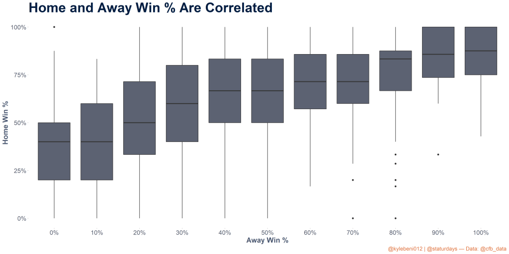
Correlation between home winning percentage and away winning percentage, represented as boxplots for each 10% winning percentage. There is a fairly strong positive relationship between the two, with teams that win 90% or more of home games rarely losing more than 25% of their away matchups. What Drives Home Game Attendance?
An interesting finding of my data exploration was that home attendance actually correlates more to away performances than home performances. The reasoning behind this might be that fans watch their teams play well on the road, and then get a desire to go see them in person when they’re home. If they watch their team on TV and they stink, they’ll be less motivated to go buy a ticket to see that trainwreck in person.

Home and Away winning percentages plotted against average percent of stadium capacity at home games. Performing well away from home actually leads to higher likelihood of sellout crowds than home performances. So teams that play completely average and win 50% of games are better off doing so away from home, as it leads to nearly 15% higher home capacity than doing the same at home.
Building A Regression Model
Okay, let’s finally get into it and put some numbers to these relationships. We’re going to build a linear regression model to see if the relationship between stadium size and home record is significant, along with how significant the other factors like attendance and away record are in determining home record.
Since we’re trying to get an idea of how important each feature is in the regression, we need to ensure that no two variables are too highly correlated. I used Variance Inflation Factor (VIF) to determine this, and found that attendance and stadium size are too similar to use both (they are correlated at 90%), however stadium size and percent of the stadium filled on average are not, so I dropped raw attendance data and instead went with the following three variables:
- Stadium Size
- Average percent of capacity filled
- Away Record
I’m using this to predict a team’s average home record over the course of their games at that stadium. For this reason, I’m using a linear model since the response variable is continuous from 0 to 1. Note: in hindsight, the best model to use in this situation would be a Beta Regression, which is specifically for continuous response variable s between 0 and 1 like my situation, however not knowing much about it, I’m not going to get into it for the sake of simplicity. I’m not doing rocket-science here, after all.

Results of linear model. Only the team’s away record was significant. After running the model with those three variables, we find that neither stadium size nor percent of capacity are significant factors when team strength (via away record) is included in the model. This indicates that regardless of the size of stadium a team plays in or how packed the house is on average, they will perform to their best abilities over time. This is fair, but what if we look at an individual game. Can we gain any predictive power by factoring in the crowd size or venue when trying to determine the outcome of one game?
This time, I chose to use logistic regression to see if a model that included the attendance, stadium capacity, and percent of the stadium filled could outperform one that solely relied on the Elo rating of the two teams. We’re using logistic regression because we’re trying to predict a simple True/False of whether the home team won the game or not. This data excluded 2020 because the attendance data is far from complete, so we’ll just assume it’s a normal year. And in a normal year, it turns out that none of those variables are useful relative to Elo ratings alone.

Results of logistic regression. Only the Elo rating was significant. The size of the stadium was the closest variable to being significant, but I would guess that the model was recognizing some of the larger stadiums and starting to correlate that to a better outcome for the home team, when in fact the physical size and capacity of the venue doesn’t mean much. Similarly, the number of people in the stadium or percent of the stadium filled didn’t seem to matter either.
