And now for something completely different. I spent the evening watching the Premier League on NBC, and, as I normally do when watching EPL games, found myself marveling at the beautiful simplicity of the score bug. It leaves nothing of importance out, includes a minimal ad so that I don’t have to watch commercials, and keeps the majority of the screen free for the luscious green pitch and stark blues and reds of Chelsea and Liverpool. It’s one of my favorites.
I’ve also seen some downright atrocious score bugs in my day, which inspired me to write this article. I’ll start with college football since this is a college football site on normal days.
College Football
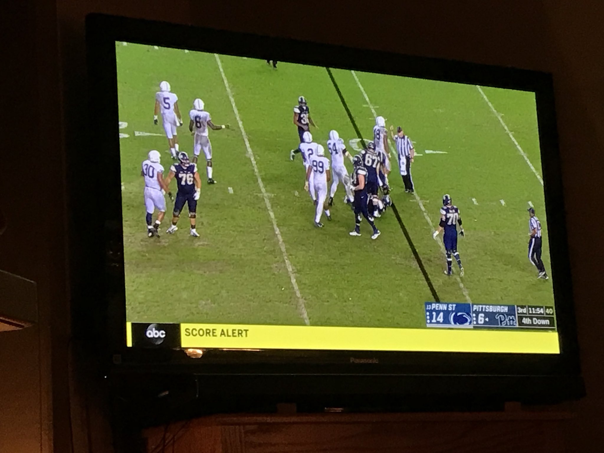
ESPN — B-
ESPN’s score bug has a lot of potential, but it fails to deliver in a couple key areas.
Location: You may be wondering why the heck it’s so high up on the screen? It looks odd and unnatural. Well that’s because ESPN places their massive news bug below the score bug, resulting in a good eighth of the screen being lost to news and score updates. The innovation of the news bug was great, but it grew to double it’s original size for no apparent reason, and it’s persistent nature seems unnecessary. The score bug itself is also a bit taller than is necessary.
Use of Space: It uses too much space, as was mentioned above. There’s plenty of room for a more concise layout if you get rid of the logos, or incorporate them in some other way that doesn’t force the bug to be so tall.
Aesthetics: A long, narrow bar does have a bit of a nice feel to it. The logos are pretty. However, it does look a bit video-gamey and lacks consistent style from one side to the other.
Information: A major source of confusion with the ESPN broadcast is the “Score Alert” on the news bug. It turns the entire bottom of the screen bright yellow and makes me think there’s a flag on the play every time. This is a massive oversight and I’m not sure how it wasn’t rectified within one week.
FOX — B
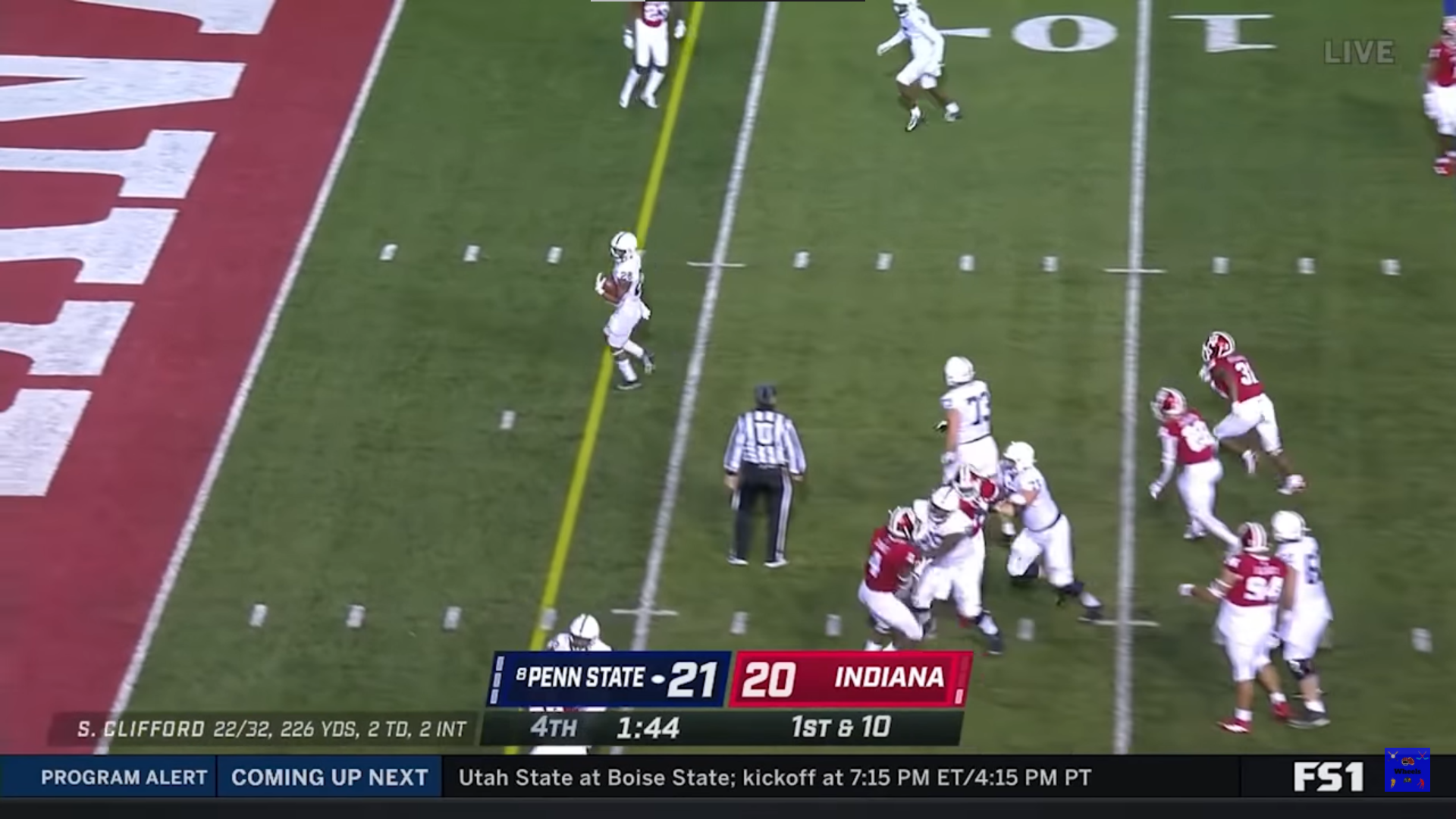
First off, credit to me for doing a proper self-own on this screengrab. This FOX bug is compact, but the placement at the center of the screen is questionable, and combine it’s height with their news bug at the bottom and you run into most of the same problems that ESPN has.
Information: One major issue with the FOX score bug is the difficulty in distinguishing between the play clock and the game clock. The two clocks are similar in styling, and the game clock is inexplicably off to the left while the play clock is in the middle. My preference and assumption is that the middle clock should be the game clock, and the play clock belongs off to the side somewhere. Now, this doesn’t matter 90% of the time, but at the end of the game when the game clock is under 40 seconds, you forget which one is which and can’t distinguish between the two.

CBS — B
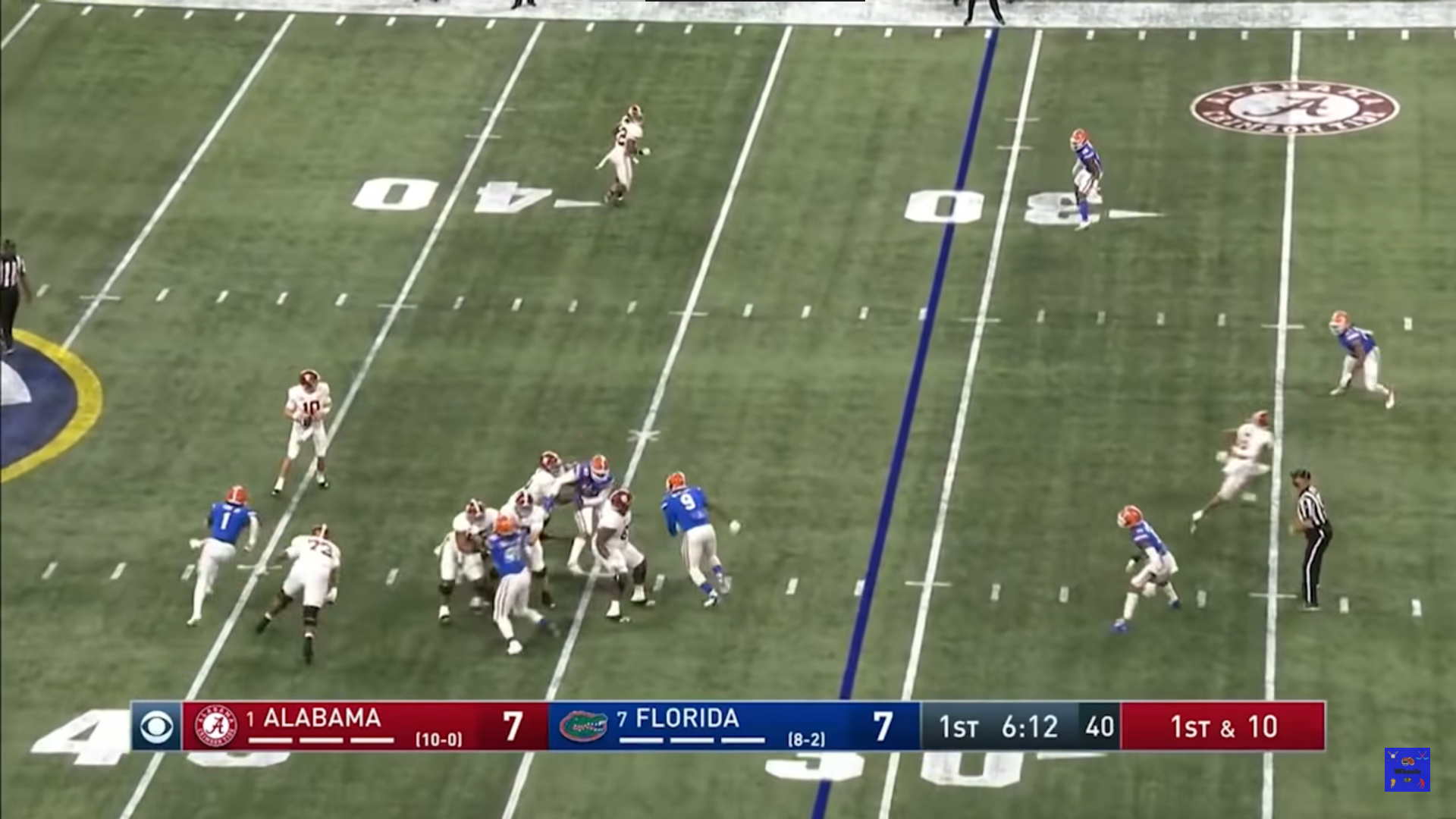
This one mostly takes after ESPN in most of its design elements. It captures all the same information, but it has a bit more of a classic and clean feel to it. It may or may not be skinnier than ESPN’s, but it certainly feels like it takes up less real estate. However, it doesn’t need to be so high up on the screen. Just drop it at the bottom.
Soccer
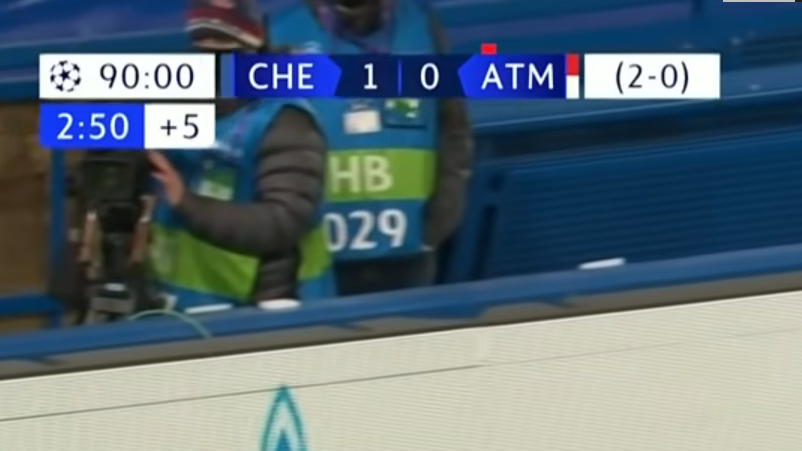
Premier League (NBC) — A-
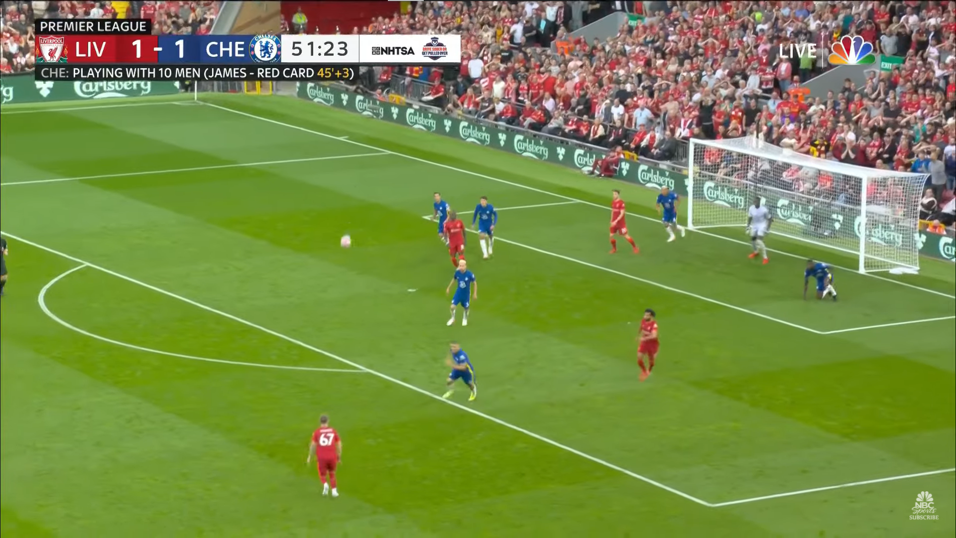
As I already stated, this is one of my favorite score bugs. Not only is it placed strategically to rarely cover up any of the action, but it is completely clean and elegant in its design and conveys a lot of information. The best part is that it changes dynamically with the game itself, as you can see above. When a player gets a red card, it lets you know who and when.
Champions League (CBS) — A

This bug from CBS for the Champions League has most of the same qualities as the NBC one, and it even takes up less real estate. It has a nifty way of indicating red cards which almost gives it a leg up on the NBC one. I can’t believe I’m saying this but I think it might be better!
Auto Racing
Formula 1 (F1 Media) — A+
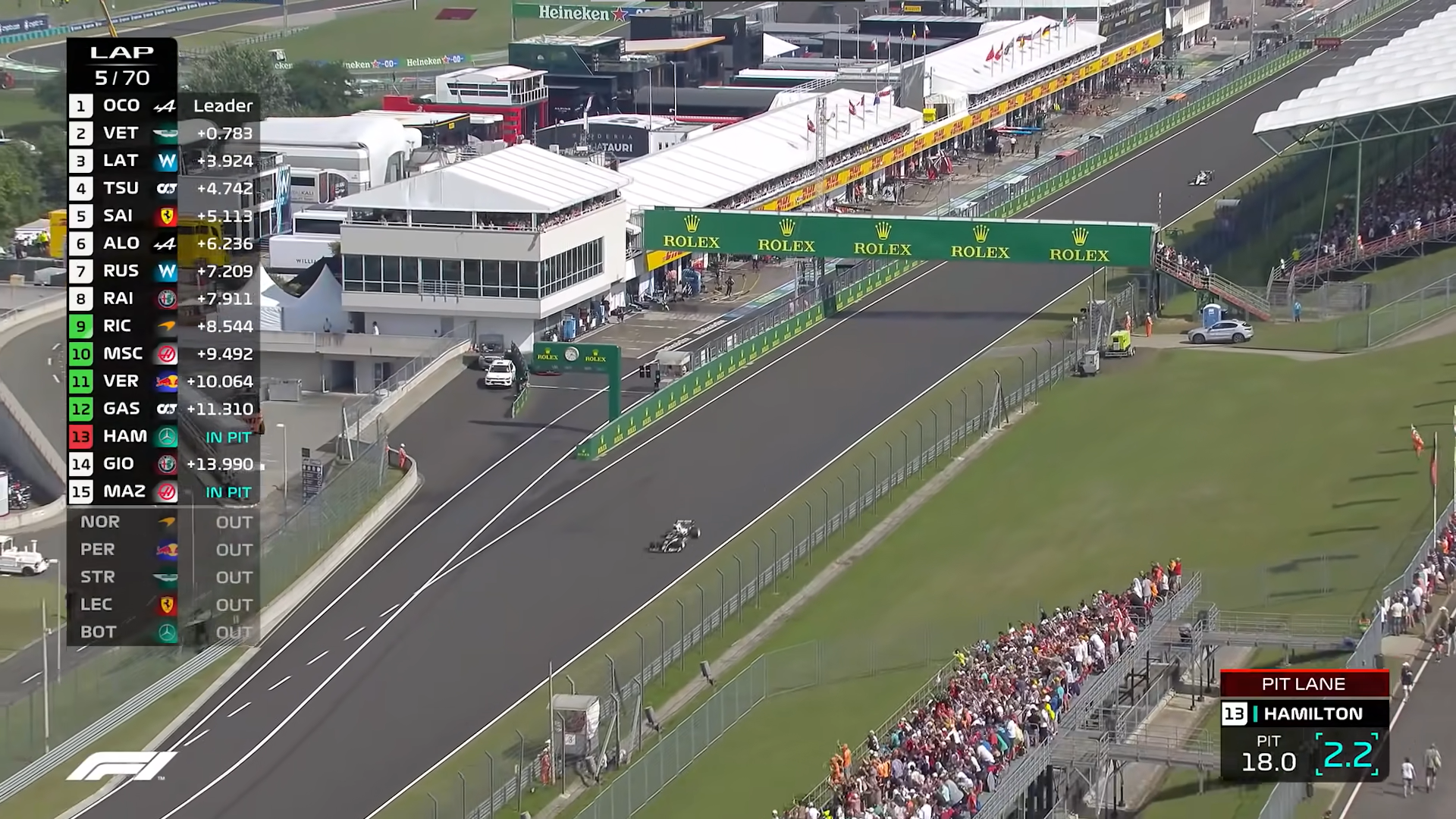
Now I may be a bit biased because I’m a stat guy, and this one is the most stat-intensive bug there is, but Formula 1’s on-screen graphics definitively take the cake. They are transparent, slick, and dynamically display relevant information depending on the situation and the commentary. While the graphic is one of the larger ones, it’s acceptable thanks to it’s transparency and their ability to collapse it down or remove it completely when they want.
Formula One is one of the unique circumstances where the league itself actually control the camera angles and graphics, so every broadcast partner around the world can use their live feed. The downside is that they can’t choose their own camera angles when the commentators have something specific they want to see, but the plus side is you get these fantastic graphics that the sport has put a lot of time and effort into perfecting and catering specifically to the needs of the sport and fans.
One of the absolute coolest feature is their ability to pop in a picture-in-picture from a second car directly within the score bug. They also have a simple system of purple, green, yellow to help indicate whether a driver is currently fastest overall, improving on their own time, or slowing down.

NASCAR (FOX) — C
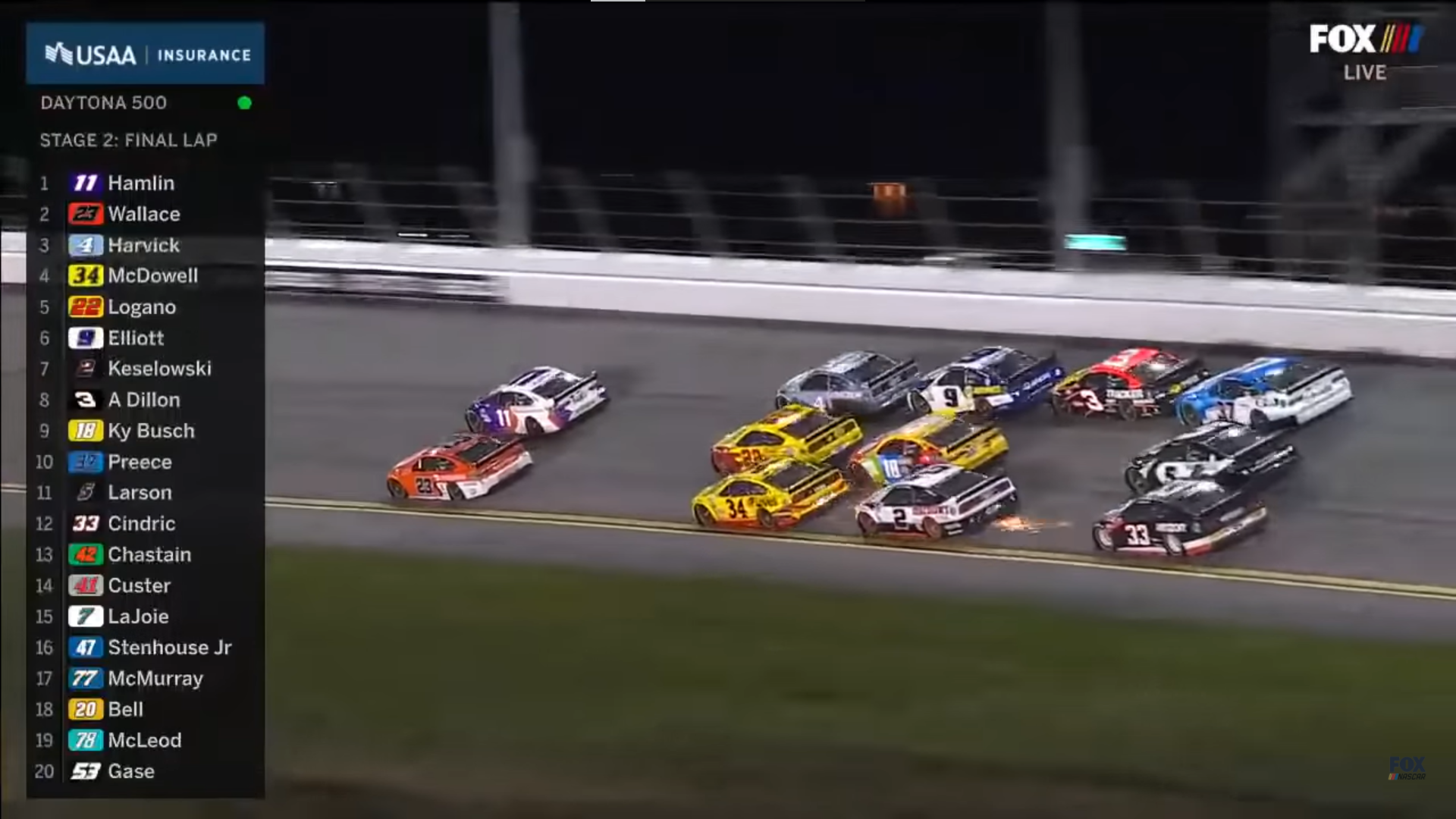
In NASCAR, they don’t seem to care as much about your time behind the leader as they are your position on the track. This makes sense, however this bug is really run of the mill, and seems unnecessarily large. Since all the cars are bunched together and on the screen at the same time, there doesn’t seem to be a huge need to have this giant leaderboard. The crawling bug at the top or bottom of the screen seems to be a better option for a sport like NASCAR. I think that abbreviated names would make more sense and save some width on the screen.
Indycar (NBC) — C
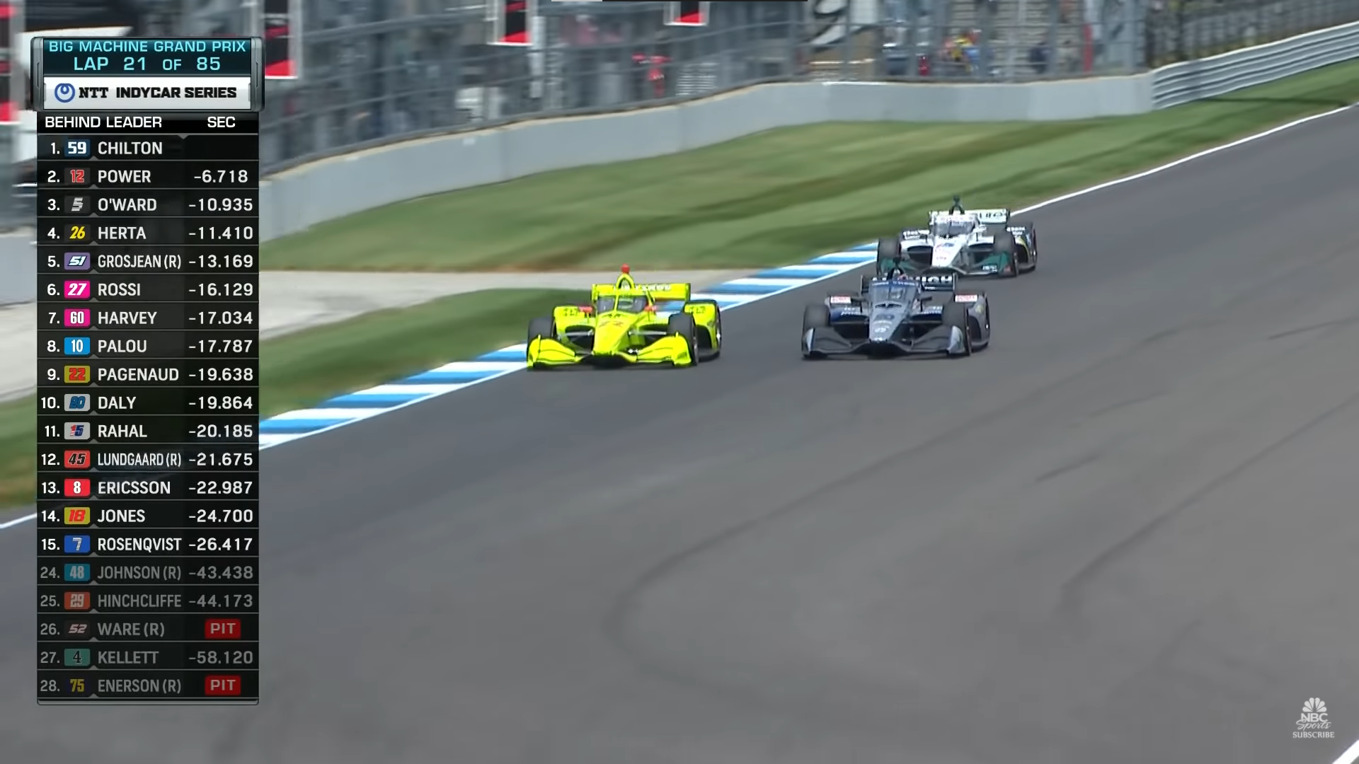
Again, this bug suffers the same pitfalls as the NASCAR one. The names are too long, making the graphic too wide. It also has that video-gamey look to it. Why they don’t just copy the F1 graphics, I don’t know.
Basketball
NBA (TNT) — A
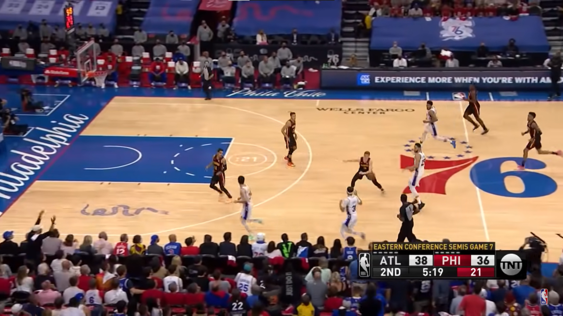
Compact, clean, well-positioned. Has all the necessary info you need, and not much more. You can’t go wrong with something like this.
NBA (ESPN) — D

Again, just a terrible use of space. It’s too tall for no reason, and granted, it’s not blocking much, but if someone is taking a corner three at the bottom of the screen, I’m not going to see his feet. Lose the advertising on the right side, and this could take up less than half the current space.
March Madness (Turner) — C-
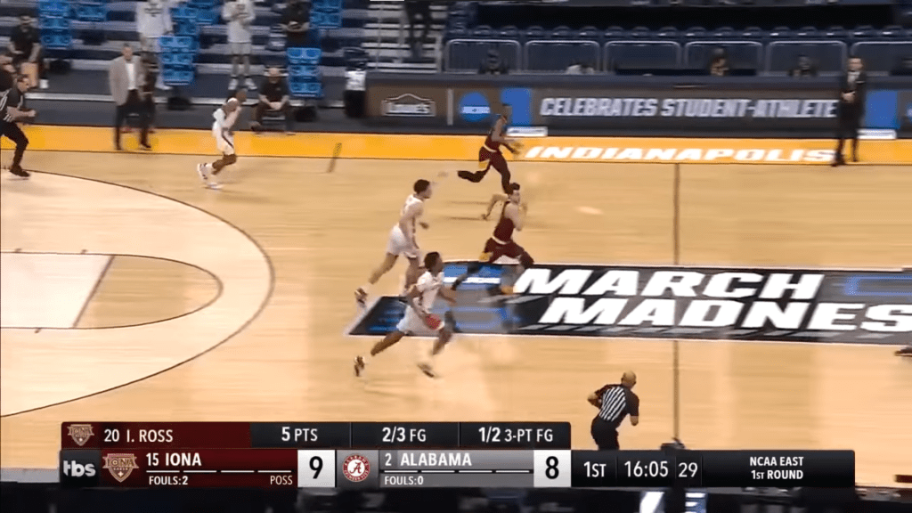
This one is again a bit too tall for my liking, and they’ve placed it above the absolute bottom of the screen. There’s no reason for that. It is nice to know what round of the tournament you’re watching, but it probably doesn’t need to be that wide.
Hockey
NHL (NBC) — A-
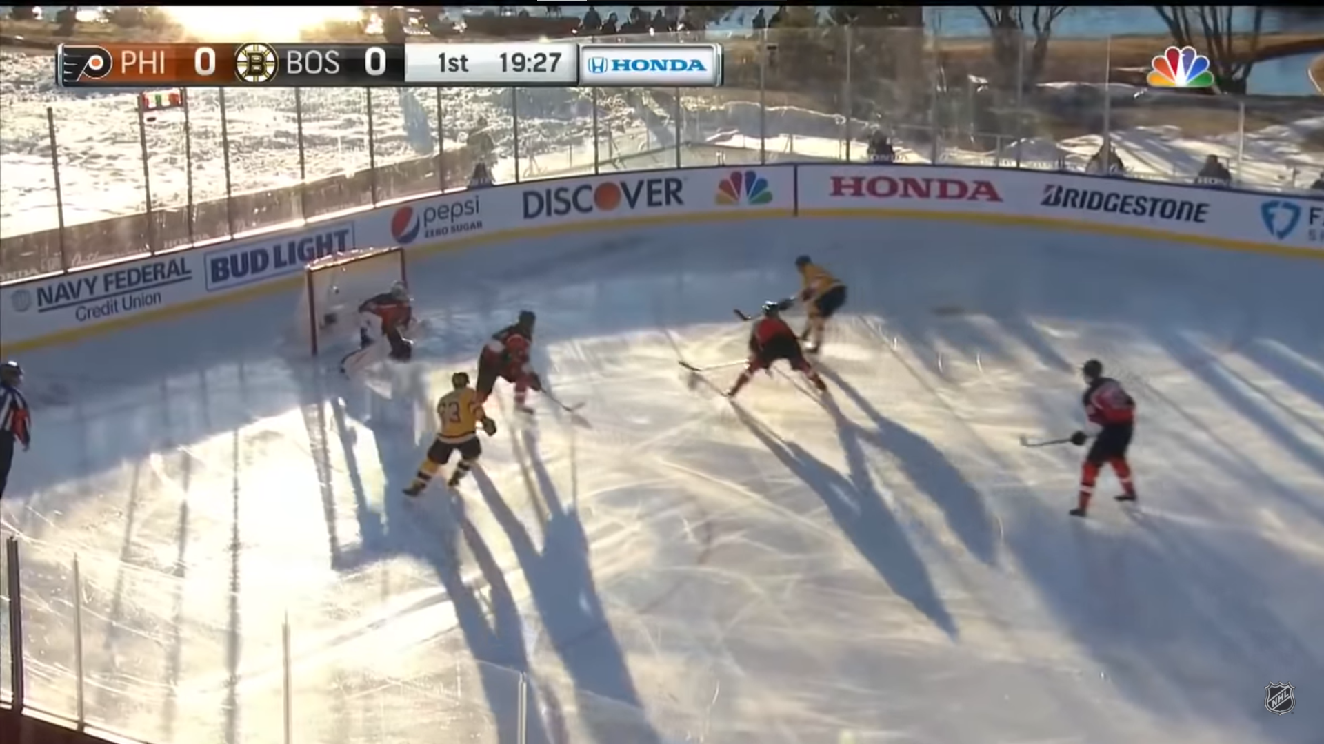
This is another great example of less is more. They pop out a detail when someone is in the penalty box, but that’s really all the info you need most of the time. It’s clean, compact, and well-located on the screen.
Conclusion
So, after reviewing bugs from a variety of different sports, I think there are some key tenants all sports can strive for when designing theres.
- Location – Know your sport and your camera angles, and place the bug out of the way of the action. Your best bet is up in a corner as far to the edge of the screen as you can.
- Compactness – Consolidate all the key information into as small a space as you can that is still readable.
- Transparency – This is a nice backup for those times when your graphic inevitably covers up a bit of action.
- Dynamicism – This gives you the flexibility to expand the layout when appropriate to add some extra info, or change the info displayed altogether.
Have a score bug you want graded? Send me a screenshot at kyle@staturdays.com.